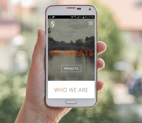
exSite’s New Look
We just launched our new website and wanted to let you know about the changes we made.
It’s been a while since we last updated our website, and exSite has changed quite a bit since then. Our original design was function over form. Our intentions were to give as much information to the client as possible, and we heavily branded everything to help offset the fact that we were a recent start-up.
Now we’re more experienced and steadfast, so we wanted our online presence to reflect who we are today.
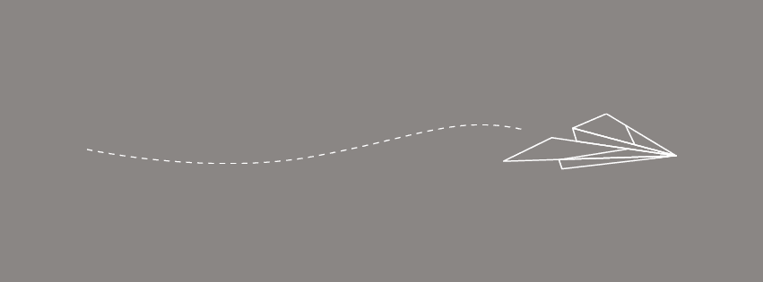
A key part of our rebranding has been our use of the paper airplane. It symbolises our work: hand-crafted, fast online solutions that are contemporary and clean. It’s also fun and reflects our friendly, dedicated customer service and collaboration.
We greatly reduced the amount of content on our site to refine our message and to help make us more approachable to the less tech-savvy user. We also enhanced our use of white space. The white space adds a simple and professional feel to the site, and it also gives users a chance to breathe between images and text.
With our new site, we opted to use our brand colour more subtly. Rather than using it as a background, we’ve defined our use of orange to emphasis and action. Our orange enhances elements of our site and guides the user through their experience on our website.
There’s also a playful aspect to our new website in our layout, in the tone of our text and in the recurring theme of the paper aeroplane. We added this playful element because we love what we do and we love giving clients solutions that we’re proud of.