Metalman Brewing
Introduction
Metalman is a microbrewery in Waterford with a mission to bring a wider beer selection to Ireland. The company had humble beginnings in 2011 when they started contract brewing at another brewery in Tipperary. Now, they produce all of their beer out of the 24HL Metalman brewhouse in Waterford city.
Metalman came to exSite seeking a refresh of their existing website and assistance with PR. They also asked us to create beer can labels for a new collection of retro space exploration-themed beer.
To view the full case study, click here.
Website
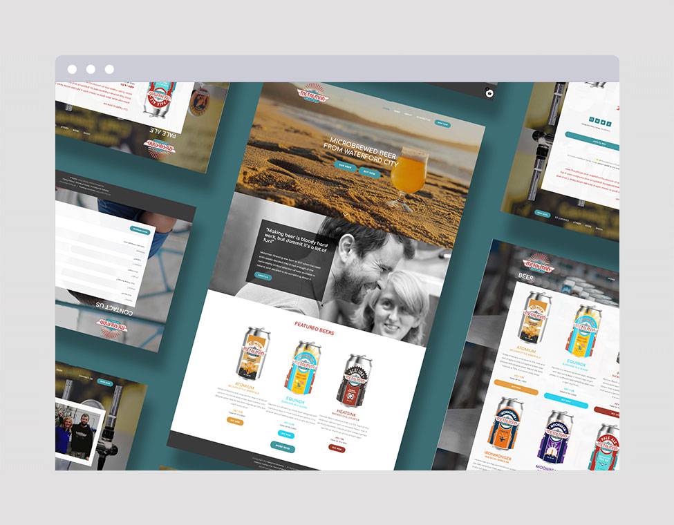
Our first task was to refresh Metalman’s existing website, on a tight budget. Metalman wanted to keep their site’s clean and colorful aesthetic but improve the overall visual design. Their site lacked clear calls to action and was difficult to navigate at times.
The new design stays true to the brand’s identity by using brand colors for call to action buttons throughout the site. It also prominently features the Metalman logo, as well as images of their beers and brewery, throughout the site.


Top: The hero section of Metalman’s original home page. Links for various buying options feel out of place and distracting, and the slogan is pushed off to the side. Bottom: In the new hero section, the slogan “Microbrewed beer from Waterford City” is front and center, with several clear call-to action buttons directing the customer to browsing and purchasing options.


Top: On the original site, only partial can labels were visible when browsing through different offerings. Bottom: On the new site, full can images are visible, and the “buy now” call to action button is much more visible.
Packaging Design

Initial Iterations
Metalman also came to exSite for the creation of labels for a new series of beers, themed after retro space exploration. Metalman wanted to completely depart from their 1920’s art deco aesthetic for this range.
Our initial inspiration came from vintage travel posters, for locations on Earth and throughout the galaxy! After creating a mood board, two general themes emerged. Some posters had a more realistic approach with scenes of nature and travelers. Others had a geometric, abstract approach, with collages of simple shapes making a larger image. Our two initial concepts were based on these two themes.

The travel poster concept recreates a classic vintage travel poster with a semi-realistic rendering of a Martian landscape.

The geometric concept uses abstract, geometric shapes to create images of space travel.
Second Drafts
Metalman ultimately preferred the more geometric approach. Moving forward, they wanted the design to look more mature, and to add complexity to the composition of the design.


The second round of iterations for the geometric concept.
The Final Product
After some revisions to flesh out the designs and ensure the labels complied with legal requirements, we arrived at the final iterations! The first flavor in the Galactic Voyager Series, Giant Molecular Clouds, is out now. And the voyage has only just begun! We look forward to continuing the Galactic Voyager concept to other cans in the series.


Final iterations of Cosmic Horseshoe, Giant Molecular Clouds, and Gravitational Wave.
PR
Metalman’s PR brief for Phase 1 of the campaign was clear – increase brand awareness and launch the new Galactic Voyager Space Series.
To deliver this on a tight budget and timeline, our communications partner, leading independent agency Dynamics PR, developed a strategic approach to claim a share of voice in a cluttered market. Working closely with designers at exSite and Metalman’s social media company Marla to ensure an optimal 360 outcome, Puffin and her team at Dynamics PR delivered both business and product-focused results on a national platform in high-impact gold print titles, and online, targeting key bloggers, podcasters and influencers in the all-important craft beer fan base.
The PR pitch had several elements: Dynamics PR packaged and framed Metalman’s 10 years in business and the owners’ backstory into a compelling narrative. Details of the new Galactic Voyager range and interesting product shots completed the press pack. They also ensured key print and online writers received samples of the range to try for themselves. The last vital ingredient was their little black book of media contacts which they leveraged to achieve targeted and effective campaign results.