Mobile Navigation
Why Do You Need a Mobile Site?
Mobile sites are the best way for consumers to interact with your business while on the go. As a mobile site is a quite a bit smaller than a desktop site, the interface needs to be compact and streamlined. In particular, the navigation must be pared down and only include the most important links.
Most people have learned to navigate mobile sites, but you should still keep usability in mind. A mobile site cannot be an exact copy of the desktop version—it’s just too big! You should also keep a careful eye on the layout to make sure that people can navigate with their fingers. Few things are more frustrating when browsing the web on mobile than not being able to navigate a site.
Having a mobile site benefits consumers as well as businesses. As a business, you should take extra care to make sure your site is usable on mobile and use traditional navigation methods to help guide your audience around your site.
What Are the Benefits?
Mobile sites are vital to any modern enterprise. They are the best way to increase revenue going forward. Mobile shopping has overtaken brick-and-mortar and desktop shopping. Over 55% of online shopping was done via mobile devices (Internet Retailer). According to a 2012 Google survey:
- 74% of visitors were more likely to return to mobile friendly websites
- 61% were likely to leave if a site wasn’t mobile friendly
- 67% were more likely to buy at a mobile friendly website
Make Your Mobile Site Usable
The best way to get, and keep, consumers is a site that they will enjoy using. Here are some suggestions:
- List the most used pages first because they will be the one consumers want the easiest access to.
- Keep navigation simple and easy to use. People want to use your site—don’t make them work for it.
- Don’t have complex or long titles. The more complex the navigation is, the higher chance the consumers won’t stick around.
- Have a handle on the fonts and colour choices. Text should be big enough to read, require no zooming, and minimise eye-strain.
- Make the names of links clear. Consumers should know exactly where their click will take them.
- People will be navigating your mobile site with their fingers. Remember that the average finger requires about 44 pixels, so allow your code to respond to at least 45 pixels to improve user experience (Apple).
- Incorporate touch feedback. There should be a visual cue that the site has reacted to their interaction with the site so that people know that what they pressed is a link and that it does work.
Navigation Methods
Search Bar
The search bar is one of the first navigation methods, but it should be used to supplement your navigation, not be the only way to navigate. The magnifying glass is the international symbol for the option to search, so you can save space on your site by using that icon instead of the words “Search.” The search option is most useful for people who are searching for a specific topic or title. Make sure that the search program(s) you use have an effective algorithm, or people won’t be able to find what they need.
Menu Icon
Instead of having to list your navigation in your header, having a menu icon (usually 3 short horizontal lines) allows you to hide the navigation menu in one of the top corners of a site. Menu icons conserve space and expand to take up most or all of the screen, helping to prevent people from accidentally clicking the wrong thing. Vintage Finds You has a great example of a menu icon used effectively:

Layered Navigation versus Nested Navigation
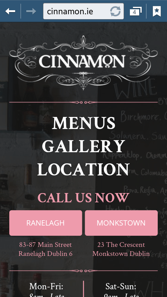
Layered navigation features a single list of items with no subitems. To make your site more user-friendly, keep the list short enough to minimise scrolling but long enough to be useful. It should include the core concepts of the desktop site. For example, Cinnamon uses layered navigation:
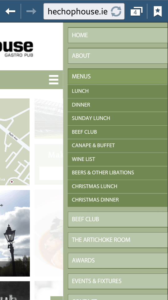
Nested navigation is like layered navigation but with subitems. If you have a large number of important pages on your site, group them together in categories that make sense to your audience. Then you can use the categories to help your audience find general topics and use dropdowns to direct them to specific pages. For example, The Chophouse uses nested navigation:
Icon v Lists
Icons are great visuals. They fit in seamlessly on sites that sell products in a way that mimics browsing through a physical store. It shows consumers what they are getting.
Lists are great because they are more descriptive than icons, so people can find what they need easier. Lists are especially useful for sites with tons of information, but they are also good for sites with less information too. exSite.ie has a good example of listed navigation items.

A mobile site is a much more visceral and interactive experience a desktop one. Make it one people remember for all the right reasons.
Not sure of your site makes the cut? Test it with Google’s webmaster’s tools. Ask how exSite can improve your consumers’ mobile experience.