Website Navigation
The way people are able to navigate within a site tells them quite a bit about a company. Quality and aesthetics are as important as content when it comes to web design.
Site navigation is necessary because a single homepage doesn’t cut it anymore. Sites need to explain the business, deliver other relevant and necessary content and have a contact page for any comments or questions. E-commerce sites should have a place for inventory and images.
Site navigation is one of the few ways to customise a site that is practical and aesthetically pleasing. Navigation should appear seamless: the less it is obtrusive the better. Finding the information you need and care about shouldn’t be difficult. Along those lines, site code must be kept up-to-date. Nothing is worse than a link on your site that leads to an “Error 404: Page Not Found”! These problems—obtrusiveness, error 404’s, difficulty in use—show lack of care.
You should carefully consider what type of navigation works best for your needs and what you are comfortable working with. Below we discuss common types of site navigation.
Main Navigation
Most sites use a horizontal navigation bar, a vertical navigation bar, or both.
Horizontal Navigation Bar
A horizontal navigation bar organizes items into a horizontal list along the top of a site. Each item is a link, and each link sends site visitors to the appropriate page or reveals a sublist for more nuanced navigation.
Horizontal navigation bars, while quite common, offer limited space for items and are often overcrowded with information. Another common issue is that items in the bar might be too generic and not particularly useful for site visitors. For example, “About Us” is more informative than “About.”
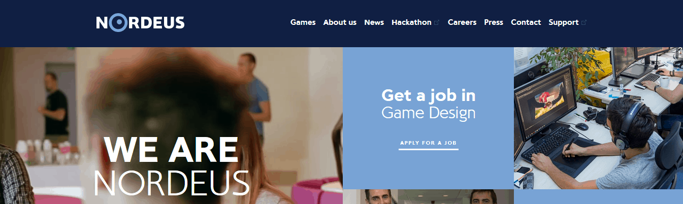
Noredus’s website uses a horizontal navigation bar.
Vertical Navigation Bar
Vertical navigation bars are often used for secondary navigation are useful for a single long list. As secondary navigation, they frequently show the organization of a single page while the main navigation shows the organization of the entire site.
Vertical navigation bars are less common as main navigation for sites, but as secondary navigation they can help keep horizontal navigation bars from getting too cluttered.
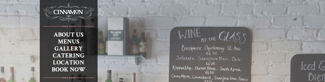
Cinnamon’s site uses vertical navigation.
Sub-navigation
Using sub-navigation is a great way to de-clutter your main navigation and help site visitors find the precise information they want faster. The main way to implement sub-navigation is to use drop downs.
Drop Downs
Drop downs are extremely common. A drop down is a series of tabs that each expand to show items categorised below them. Generally, site visitors hover their cursor over an item in the main navigation to reveal the sub-navigation for that item. (There is a way to code a drop down to only appear when a site visitor clicks on a main navigation item, but this is less common.)
Drop downs are easy to read and can be one of the most user-friendly forms of sub-navigation. However, they can be difficult to code and sometimes don’t function correctly.
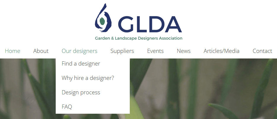
GLDA has a user-friendly drop down.
Navigation Items
Navigation items can be displayed as text or as icons.
Text
Text is the most pervasive and oldest way to display navigation items. With text, site visitors are less likely to misinterpret navigation items and are more likely to find what they need. Despite its functionality, text takes up more room that icons do, and text isn’t always as sleek, pretty, or modern as icons.

exSite’s website uses text in its navigation.
Icons
Icons are small images that represent certain concepts or that are used in place of text. They are either industry standard or simplified enough to convey a complex idea in a visual way. The most familiar icons are the images are the ones used universally, like an envelope for email and a film reel for movies. Right now, icons are popular because they are smaller and generally don’t need to convey a ton of specific information.
Be careful when using icons to display navigation items. Site visitors may misinterpret them. They might associate a particular icon with something other than what it is used for on your site. For example, someone might see an icon of a house on a site and think that that will link to the business’ address, but it could actually link to the home page.
![]()
Cultural Solutions UK uses icons to beautifully display the main navigation.
![]()
Smashing Magazine uses both icons and text in the main navigation. The cute book draws the attention of site visitors to the eBooks tab.
The better your site’s navigation is, the less likely your consumers will get lost at sea and the more likely they will find the information they need and leave your site happy.
Not sure where to start? Contact us and we’ll be happy to help.